

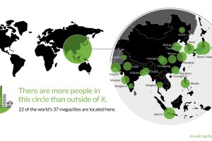
That’s right – nearly 4 billion people live inside the circle on this world map, including 22 of the world’s 37 megacities. Read more
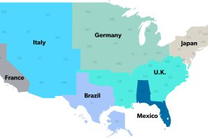
The United States has a $18 trillion economy – the biggest in the world. But here’s another way of looking at it, using three interesting maps. Read more
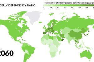
Globally, fertility rates have decreased by about half since 1960. What will happen to the economy when the world’s aging population begins to retire? Read more
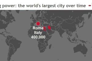
These stunning animations and interactive maps show the changing title for the world’s largest city, as well as the rapid pace of urbanization in today’s world. Read more
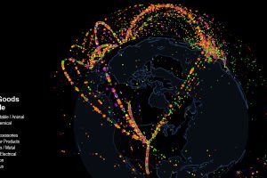
Use this interactive map to explore fascinating data on international trade. Which countries trade with each other, and which are stuck as hermits? Read more
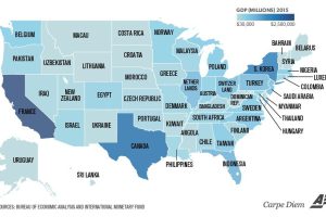
Texas is the size of Canada, and California is similar to France. Even tiny Vermont is comparable to a country’s GDP (Bahrain). Read more
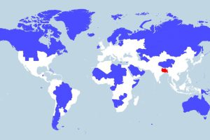
More people live in the tiny red region than all of the blue areas combined. This map really shows the disparity in population density throughout the globe. Read more
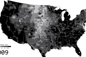
See the ebbs and flows of regional unemployment in the United States in this animated map from 1990 until 2016. Read more

Many U.S. inventions, such as the internet or airplane, have had a profound impact on the world. Here’s each state’s most important invention. Read more
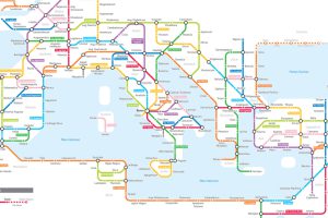
Navigating the mean streets of 125 AD just got a lot easier with this subway-style map of the ancient Roman road network. Read more