

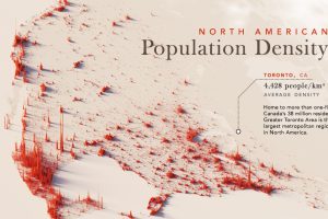
Nearly half a billion people live on the third-largest continent. We take a closer look in this population map of North America. Read more
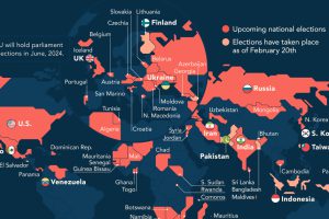
It’s election year around the world, and this map of 2024 global elections by country shows just how many people will be impacted. Read more
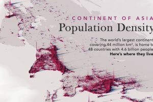
We visualize Asia’s population patterns to see where 4.6 billion people, or two-thirds of the world’s population, actually live. Read more
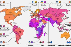
While many inspiring teachings exist about attaining individual happiness, it’s worthwhile to consider how happy entire countries are on a collective scale. Read more
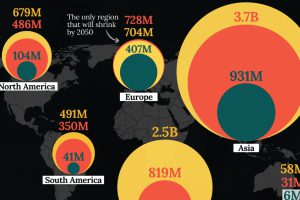
In this visualization, we map the populations of major regions at three different points in time: 1900, 2000, and 2050 (forecasted). Read more

In this map, we visualize average hourly wages across a variety of European countries, based on data from Eurostat. Read more
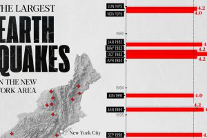
The earthquake that shook buildings across New York in April 2024 was the third-largest quake in the Northeast U.S. over the past 50 years. Read more

Want to see how intelligence varies across the U.S.? We visualized data from a 2022 study to show the average IQ score by state. Read more
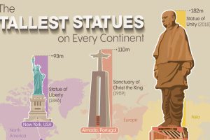
Humanity likes building tall things. So we mapped the tallest statue on every continent—excluding Antarctica—along with when they were completed. Read more
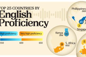
Average test scores from 2.2 million test-takers reveal which countries have English proficiency on par with native speakers. Read more