An annual income anywhere between $360,000-$950,000 can grant entry into the top 1%—depending on where you live in America. Read more
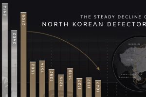
Why are the number of North Korean defectors decreasing? We cover the number of defectors by year and map their perilous escape routes. Read more
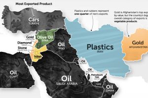
It’s more than just oil. This map of Middle East exports shows the top global product of each country by value. Read more
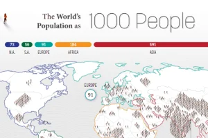
How would all the people in the world be spread out if there were only 1,000 people on Earth? This interactive map examines the breakdown. Read more
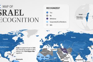
Belize is the latest country to suspend relations with Israel as of November. In this graphic we map the recognition of Israel by country. Read more
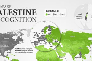
As of November 2023, 138 of the 193 UN members recognized Palestine. This map shows the recognition of the State of Palestine by country. Read more
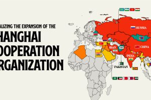
Established by China, Russia, and former Soviet states, the SCO serves as a counterbalance to Western influence in Eurasia. Read more
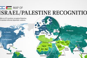
In this visualization, we look at how international recognition of Israel and Palestine breaks down among the 193 UN member states. Read more
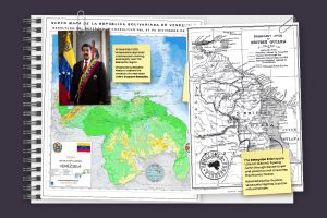
In this series of maps, we explain the dispute that has spanned nearly two centuries over the vast Essequibo region. Read more


