

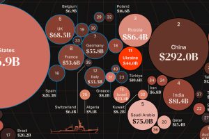
War in Europe has caused Ukraine’s military spend to jump up by 640%. How do the world’s largest military budgets compare? Read more
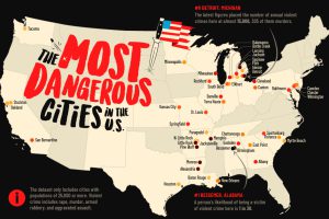
This map shows the most dangerous cities in the U.S. in terms of the violent crime rate per 1,000 residents. Read more
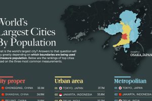
This graphic uses data taken from latest official censuses and projections to rank the largest cities by population. Read more
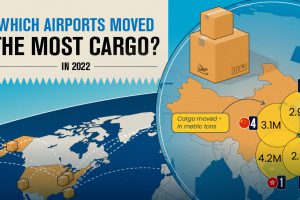
Cargo that moves through airports represents the value of around 35% of world trade. These hubs move the most cargo globally. Read more
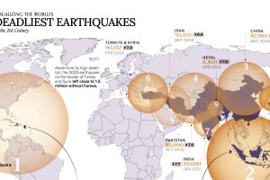
A powerful earthquake rocked Morocco on September 8, 2023, potentially killing thousands. Here are the deadliest earthquakes this century so far. Read more
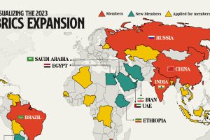
We provide a data-driven overview of how the recent BRICS expansion will grow the group’s influence and reach. Read more
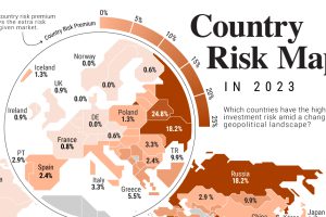
Where are some of the riskiest countries to invest in the world? Where are some of the safest? This graphic shows country risk in 2023. Read more
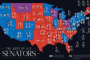
How old is the country’s political establishment? We map the age of U.S. senators in every U.S. state to find out. Read more
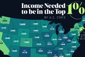
An annual income anywhere between $360,000-$950,000 can grant entry into the top 1%—depending on where you live in America. Read more
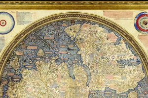
Check out the Fra Mauro Mappa Mundi (c. 1450s), a historical map that formed a bridge between medieval and renaissance worldviews. Read more