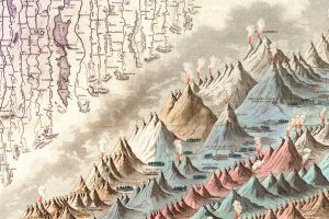
This iconic infographic map is an early and ambitious attempt to compare the world’s tallest mountains and longest rivers. Read more
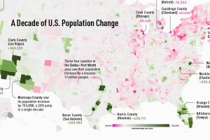
This map shows which counties in the U.S. have seen the most growth, and which places have seen their populations dwindle in the last 10 years. Read more
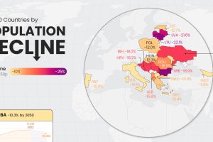
Population decline is a rising issue for many countries in Eastern Europe, as well as outliers like Japan and Cuba. Read more
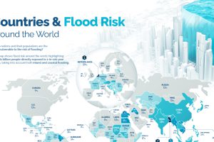
Recent floods in Pakistan have affected more than 33 million people. Where is the risk of flooding highest around the world? Read more
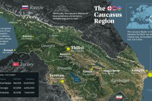
There has been intermittent fighting in the Caucasus region for decades. But what is the area like beyond the conflict? This map takes a look. Read more
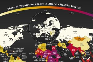
More than three billion people across the globe are unable to afford a healthy diet. See which countries are most affected. Read more
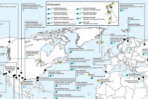
This map is a comprehensive look at both existing and proposed spaceports and missile launching locations around the world. Read more

Many countries around the world are facing double or triple-digit inflation. See which countries have the highest inflation rates on this map. Read more
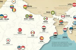
This map juxtaposes nations and Indian states to provide a new perspective on the world’s soon-to-be most populous country Read more
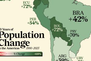
Nearly every country in the Americas has seen a population boom in the last three decades. Some have doubled in size. Read more

