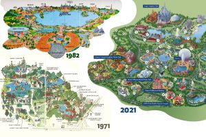
Historical maps highlight the Magic Kingdom’s dramatic transformation from swampland to the biggest theme park in the world. Read more
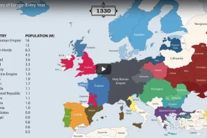
The history of Europe is breathtakingly complex, but this animation helps makes sense of 2,400 years of change on the European map. Read more
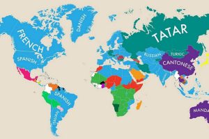
This fascinating map highlights the second most commonly spoken primary language in almost nearly every country. Read more
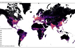
This detailed map looks at where humans have (and haven’t) modified Earth’s terrestrial environment. See human impact in incredible detail. Read more
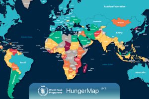
Every day, hunger affects more than 700 million people. This live map from the UN highlights where hunger is hitting hardest around the world. Read more
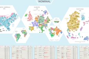
Where does the world’s economic activity take place? This cartogram shows the $94 trillion global economy divided into 1,000 hexagons. Read more
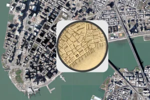
The early 1800s were a time of rapid change in New York City. This map shows the city in 1836, alongside the modern day metropolis. Read more
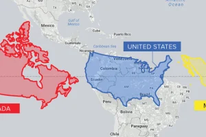
Conventional cartographic techniques have caused many to have a skewed perception of the true size of countries. Can an equal-area map provide clarity? Read more
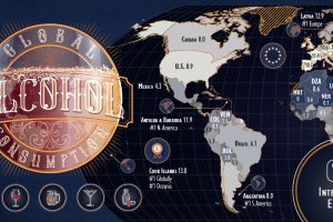
Which countries are the world’s biggest alcohol drinkers? This interactive map explores global alcohol consumption per capita. Read more
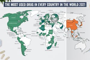
What are the most commonly used illicit drugs around the world? Read more

