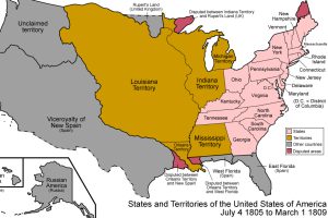
From the Thirteen Colonies to present-day USA, this animation is a detailed look at how borders have shifted throughout the nation’s history. Read more
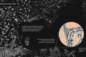
Machine learning technology is allowing researchers at Facebook to map the world population in unprecedented detail. Read more

This striking map depicts all the stars and celestial bodies that are visible in the night sky, all on one giant backdrop. Read more
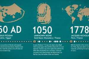
What did ancient maps look like, before we had access to airplanes and satellites? See the evolution of the world map in this nifty infographic. Read more
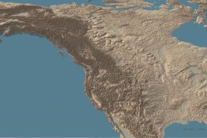
This stunning set of 3d maps purposefully exaggerate the elevation scale to show you the mountains of both the United States and North America. Read more

Few global trends have matched the profound impact of urbanization. Today’s map looks back at 70 years of movement in over 1,800 cities. Read more

Crippling student debt in the U.S. has reached a record high of $1.5 trillion nationwide. Today’s map breaks down which states bear the highest burden. Read more

This epic attempt to condense the history of the world — including the rise and fall of empires — fits into a single video. Read more
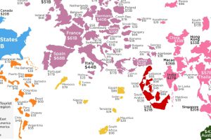
How much do your vacations contribute to your destination of choice? This visualization shows the countries that receive the most tourist spending. Read more

We breakdown the world’s largest stock markets by country, highlighting the massive growth of the U.S. and Asia. Read more

