
This animation shows the population density of U.S. counties between 1790 and 2010, showing the westward expansion of the country’s population. Read more
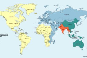
This simple map visualization will change how you think about global population, and how people are distributed throughout the planet. Read more
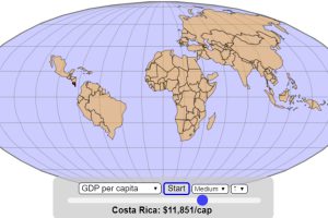
How does the world map change if it gets assembled based on the size of economies, in ascending order of GDP or GDP per capita? Read more
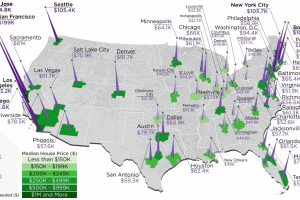
The annual salary needed to buy a home in the U.S. ranges from $38k to $255k, depending on the metropolitan area you are looking in. Read more
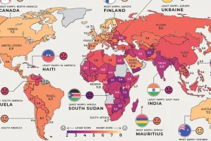
Where are the happiest, least happy, and fastest improving countries worldwide? We’ve broken down this annual ranking by region to answer that question. Read more

When goods traveled to new regions, their native names sometimes hitchhiked along with them. This map shows the spread of loanwords around the world. Read more
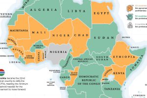
The Gambia recently became the latest country to ratify the African Continental Free Trade Area (AfCFTA), helping the landmark agreement reach critical mass to move forward. Read more
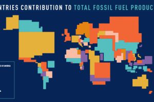
These four animated cartograms show the nations leading the world in fossil fuel production, in terms of oil, gas, coal, and total hydrocarbons. Read more
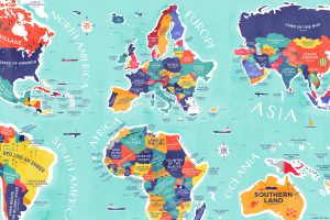
From Colombia to China, explore this map to uncover the diverse histories and cultures represented in the literal translation of each country’s name. Read more
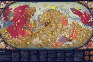
For centuries, humankind has looked at Mars from afar. In the past 75 years, space exploration has made it possible to create a map of Mars in extreme detail. Read more

