

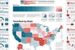
This giant infographic has state economies ranked from best to worst, based on an overall score comprised of 27 different metrics. Read more
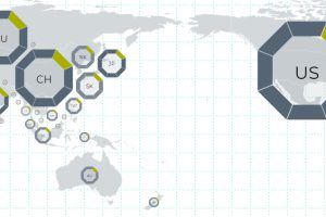
This interactive map uses 114 metrics to measure the geopolitical power and influence of 25 countries, focusing on Asian powers and the United States. Read more
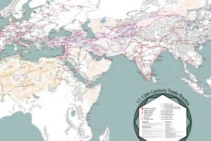
Long before container ships zig-zagged the oceans, caravans and single-sail cogs hauled goods across the world. This map is a fascinating look at that era. Read more
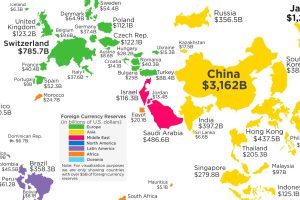
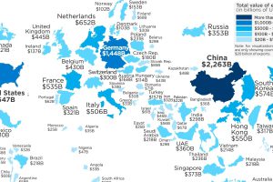
China holds a whopping $3.2 trillion in foreign currency reserves, more all of North America, Europe, and South America combined. Read more
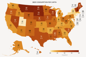
A data-driven look at consumption of America’s most popular alcoholic beverage: beer. Read more
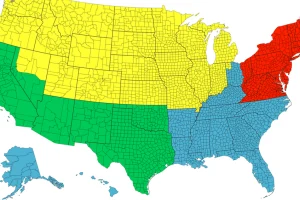
Each of the four colors is equal to 25% of the country’s total population – and things get interesting when looking at Canada, Chile, or California. Read more
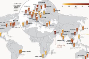
This data on the price of beer is fresh from the tap. See how much a pint of beer costs in 48 different major cities around the world. Read more
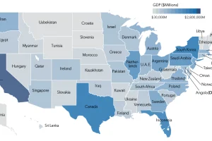
Each state has a GDP that is comparable in size to that of an actual country. This map shows it all, plus a full list of state economies and countries. Read more
This map re-sizes countries based on the amount of goods they export abroad, giving a clear look at the world’s biggest exporters of 2017. Read more
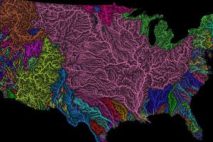
Nothing is more fundamental to life than water – so see the world’s watersheds like never before with these colorful and absolutely stunning maps. Read more