Reimagining all 200 million of the American workforce as 100 people: where do they all work, what positions they hold, and what jobs they do? Read more
Where do people work the most? Explore our analysis of the average annual working hours across OECD countries. Read more
In this infographic, we explore which cities around the world excel in prioritizing work–life balance. Read more
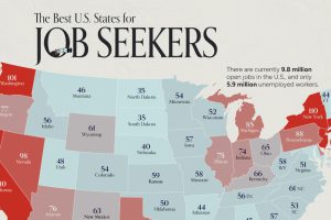
On average, there are 75 workers available for every 100 job openings across the country. Here’s how it varies by state. Read more
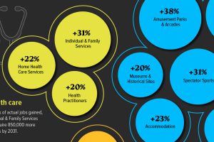
Key sectors in the U.S.—including Leisure and Health Social Services—are projected to be the fastest growing industries over the next decade. Read more
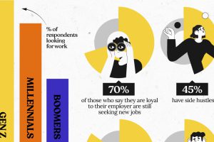
Gen Z job seekers are far more active than older generations, consistently looking for new work while already employed. Read more
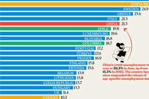
Nearly three years after COVID-19 first hit, youth unemployment in some countries, like China, has risen sharply. Read more
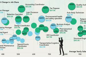
Some jobs need a degree, while others don’t. Here are the top 20 most sought-after entry level jobs with and without a degree. Read more
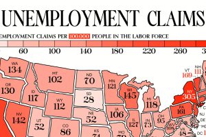
This visual heatmap of unemployment claims by state highlights New York, California, and Alaska leading the country by a wide margin. Read more


