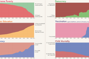
Long-term trends really allow you to see human progress on the most important indicators, like poverty reduction, education, democracy, literacy, and health. Read more
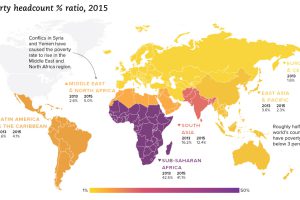
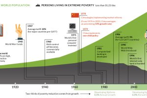
We look at the latest data from the World Bank, which reveals a drop in extreme poverty of 1 billion people globally since the year 1990. Read more
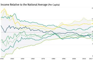
For most of the century, the geographical difference in per capita incomes has been narrowing – but it appears this trend has now reversed in the U.S. Read more
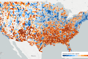
While the U.S. economic picture remains quite rosy, things change quickly when you zoom to the local level. This map shows the country’s distressed communities. Read more
This interactive graphic shows the poverty rate of every state, and also how poverty levels have changed over time according to the U.S. Census Bureau. Read more
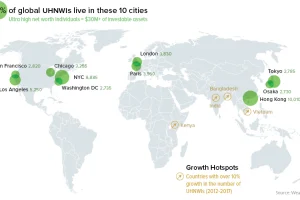
A data-driven snapshot of global wealth distribution. The average person around the world is doing better, but big-picture inequality is still staggering. Read more
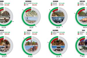
This infographic uses the measure of median household income to contrast the wealthiest and poorest counties in every U.S. state. Read more
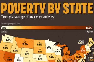
U.S. poverty rates were relatively higher in the South, compared to northern states. Which states saw the highest rates in 2022? Read more
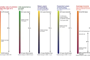
This visualization shows the global inequality gap — a difference in the standards of living around the world, as well as how it’s changed over 200 years. Read more
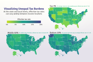
Poor families pay a higher share of their income towards state and local taxes than wealthy families. These maps show the inequitable tax burdens. Read more

