

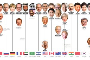
Who has led the world’s 15 most powerful countries over the last 50 years? This visual looks at world leaders from 1970 to today. Read more

With this map of U.S. presidential voting history by state, discover patterns that have emerged over the last twelve elections. Read more
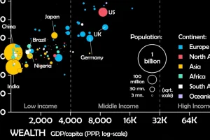
This unique animated visualization uses health and wealth measurements to chart the evolution of countries over time. Read more
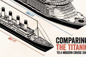
The sheer size of the Titanic was a sight to behold in 1912, but over 100 years later, how does this vessel compare to a modern cruise ship? Read more
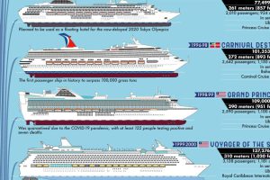
This giant infographic explores the biggest passenger ships on the open seas, over a period of almost 200 years. Read more
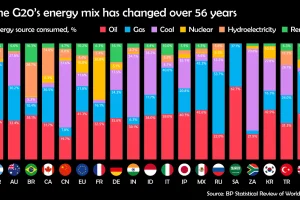
Watch how the energy mix of G20 countries has evolved over the last 50+ years. Read more
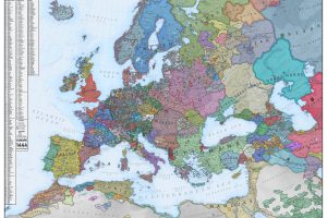
What did Europe look like in the Middle Ages? This map is a snapshot of medieval Europe back in 1444, during the rise of the Ottoman Empire. Read more

Learn the stories behind some of the world’s biggest Ponzi schemes in this illustrative infographic timeline. Read more
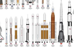
This infographic sizes up different rockets used to explore space, from the USSR’s Soyuz to the SpaceX Starship. Read more
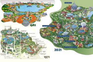
Historical maps highlight the Magic Kingdom’s dramatic transformation from swampland to the biggest theme park in the world. Read more