

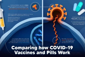
Despite tackling the same disease, vaccines and antiviral pills work differently to combat COVID-19. We visualize how they work in the body. Read more
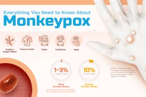
What is monkeypox, and what risk does it pose to the public? This infographic breaks down the symptoms, transmission, and more. Read more
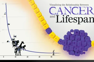
New research links mutation rates and lifespan. We visualize the data supporting this new framework for understanding cancer. Read more
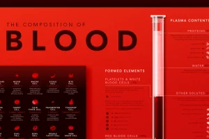
Despite its simple appearance, blood is made up of many microscopic elements. This infographic visualizes the composition of blood. Read more
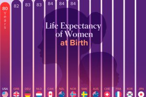
See the latest data on women’s life expectancy across a group of high-income countries. Can you guess where the U.S. ranks? Read more

Getting ready for retirement? See which states score the highest in terms of affordability, quality of life, and health care. Read more

This visual highlights the cost of insulin by country, showing how much more expensive diabetes medicine is in the U.S. Read more
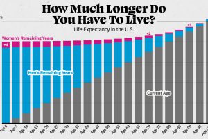
Visualizing the number of years left to live for Americans at every age, reveals the broader trends in American life expectancy. Read more

The human gut microbiome contains a world of microbes. We look at the the bacteria that deeply affect our health and well-being. Read more
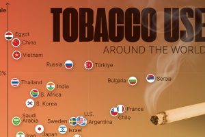
This visual shows tobacco use by country and sex, highlighting which countries still have a high prevalence of smoking. Read more