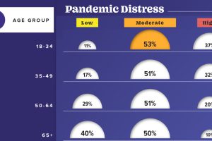
This graphic visualizes the impact of COVID-19 on emotional distress levels by different demographic subgroups such as race, education, or sex. Read more
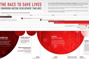
This graphic looks at how long vaccine development has historically taken for pandemics dating back to the 1900s. Read more
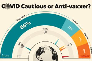
This graphic visualizes global attitudes to vaccines categorized into five segments including anti-vaxxers and COVID cautious. Read more
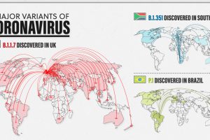
New variants of COVID-19 are spreading fast around the world. Here’s a look at the 3 major ones and how they differ from one another. Read more
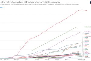
Vaccine rollouts are underway, but how quickly are COVID-19 vaccines being administered? This charts follows vaccine administration globally. Read more
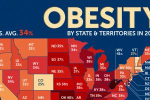
Three U.S. states recorded an adult obesity rate of 40% or higher in 2022. Which states saw the highest obesity rates? Read more
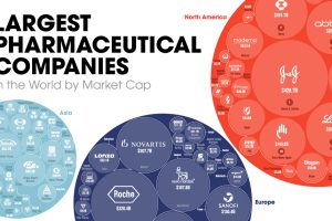
The world’s biggest pharmaceutical companies are worth $4.1 trillion. Here we map the top 100 companies based on their market cap value. Read more

Here are the 30 most prescribed drugs in America, from blood pressure treatments to asthma medication. Read more

How does the COVID-19 Delta variant compare with the original disease? Here are the key differences according to consolidated studies. Read more
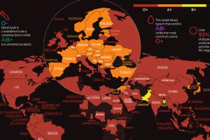
There are 8 common blood groups but 36 human blood types in total. Here we map the most widespread blood types in every country in the world. Read more

