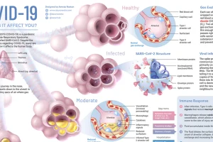
A visual explainer on what COVID-19 does to your body once you become infected, and how the virus uses our immune system against us. Read more
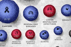
COVID-19 deaths can be hard to interpret without context. This graphic shows how many people die each day globally, by cause. Read more
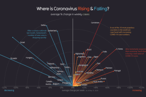
Globally, the curve of COVID-19 cases is flattening, but individual countries vary considerably as new pockets of the world deal with the pandemic. Read more
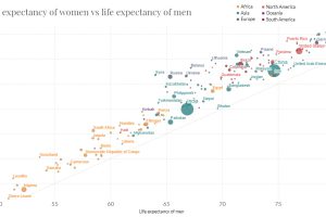
In just 65 years, global life expectancy has skyrocketed. See its ascent in this short animation, or dive into the interactive version for more data. Read more

These charts and maps show the evolution of COVID-19’s spread in the United States, by organizing data based on peak case and death dates. Read more
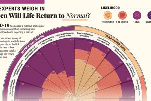
COVID-19 has caused a massive shake-up of our daily lives. Here, 511 epidemiologists offer their insights on when they might resume 20 common activities. Read more

This infographic provides a simple overview of the seven most common psychedelic substances and explores their therapeutic potential. Read more
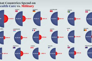
Every year, governments spend trillions on healthcare and defense. But how much is spent per person, and how does this compare by country? Read more

Since the 1990s, the opioid crisis has claimed thousands of lives. This visualization shows how the epidemic has come in three distinct waves. Read more
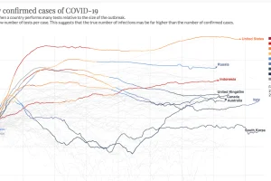
This continuously updated chart provides a more complete look at the efficacy of COVID-19 containment strategies. Read more

