


Between 1990 and 2022, preventable child deaths more than halved. However there are still challenges to overcome. Read more
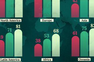
This map shows life expectancy at birth for key global regions, from 1950 to 2050F. Read more
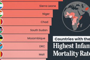
We visualize the 15 countries with the highest infant mortality rates, including countries from Africa and the Middle East. Read more
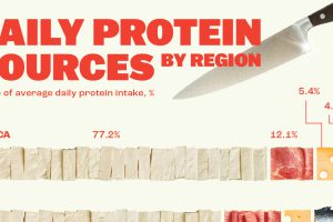
Here, we break down how people around the world get their protein intake. Read more
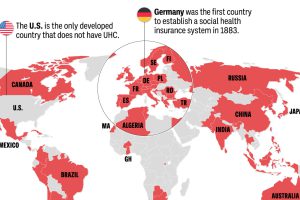
Most of the world population has universal health coverage (UHC). This map shows which countries do and don’t provide public health coverage. Read more
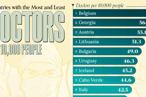
Doctor density is measured by the number of doctors per 10,000 people. A higher number indicates a more robust health network in the country. Read more
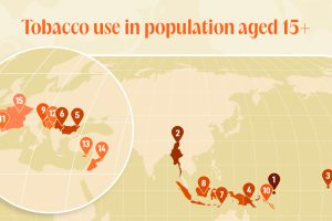
Since the 1950s, many countries have tried to discourage tobacco use and bring down smoking rates. Here’s where they haven’t worked. Read more

How cloud computing and other technology is changing healthcare. Learn in this infographic what changes in healthcare in the cloud. Read more
60,000 people in 180 different countries were asked by the OECD Better Life Index what was most important to them, and the data is presented in this infographic. Read more
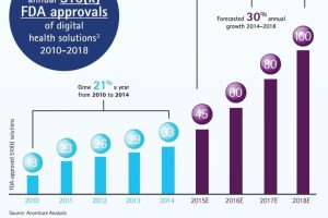
The confluence of two important trends in healthcare are about to disrupt the digital health landscape, creating savings of $50B by 2018. Read more