Exclusive report highlighting Canada’s medical cannabis industry one year after the start of the MMPR program, including infographic highlights of the findings. Read more
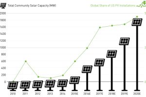
New installations of community solar farms are taking off, with cumulative capacity in the United States to increase sevenfold over the next two years. Read more
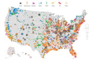
This series of data visualizations shows how the United States has generated its electricity so far in 2015 by energy source and size of each power plant. Read more
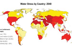
Of 167 countries examined in a report by the World Resources Institute, there are 33 that expect to have extremely high water stress by 2040. Read more
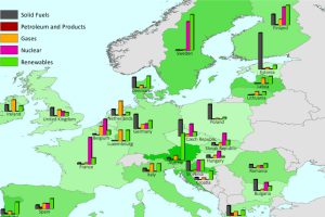
This series of charts and maps show an overview of Europe’s energy consumption, as well as consumption (per capita) by country and source. Read more
This infographic shows how five global brands are already using large amounts of renewable energy, including Microsoft, Google, Ikea, Sony, and Walmart. Read more
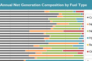
See in this .gif animation how much the U.S. electricity grid has evolved over the last two decades. Read more
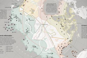
With Arctic ice thawing, the race for natural resources, shipping routes, and other territorial claims is heating up. The race for Arctic Domination is on. Read more

How does the modern wind turbine generate electricity? This animation breaks down the parts of a turbine, and how they all work together to make green energy. Read more


