

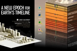
We visualize Earth’s history through the geological timeline to reveal the planet’s many epochs, including the Anthropocene. Read more

Here’s a preview of the 2023 Utility Decarbonization Index, which tracks the decarbonization progress of the largest U.S. utilities. Read more
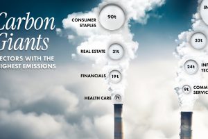
Comparing average Scope 1 emission intensities by sector according to an analysis done by S&P Global Inc. Read more

Which foods are linked with high CO2 emissions and high water use? We look at the environmental impacts of food production in this chart. Read more
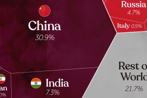
China, India, and the U.S. together account for roughly half of the world’s CO₂. This visual breaks down all carbon emissions by country. Read more
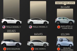
Today, electric vehicle sales make up 18% of global vehicle sales. Here are the leading models by sales as of August 2023. Read more
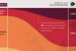
We visualize global CO2 emissions by income group, showing the impact of different wealth brackets on carbon generation. Read more
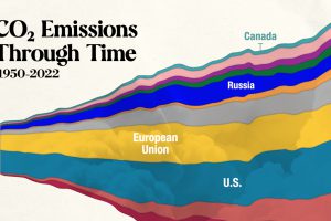
In this streamgraph, we break down global CO2 emissions between 1950 and 2022 using data from Berkeley Earth and Global Carbon Project. Read more
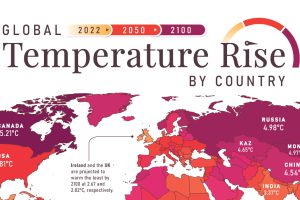
In this set of three maps, we show the global temperature rise on a national level for 2022, 2050, and 2100 based on an analysis by Berkeley Earth. Read more
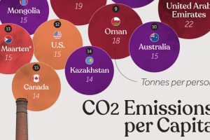
Which countries rank the highest in per capita carbon emissions, and how do they impact the world’s total carbon emissions? Read more