

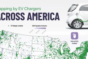
Looking for an EV charging station in the states? This interactive map contains every EV charging station in America. Read more
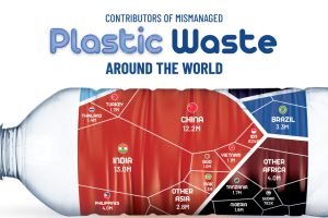
About 22% of the world’s annual plastic waste generation is mismanaged. Here’s a break down of mismanaged plastic waste by country. Read more
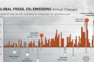
How much do global CO₂ emissions change on a year-to-year basis? Here, we show the annual rate of change in emissions since 1900. Read more
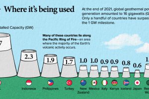
This infographic teaches you everything you need to know about geothermal energy in less than 5 minutes. Read more
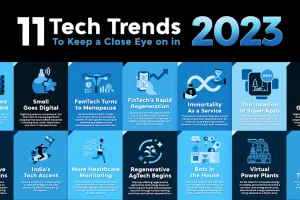
This infographic highlights eleven exciting areas within the world of technology worth keeping an eye on in 2023. Read more
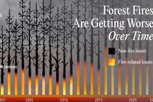
See how total forest cover lost has changed over the last 22 years, along with what portion comes from wildfire impact. Read more
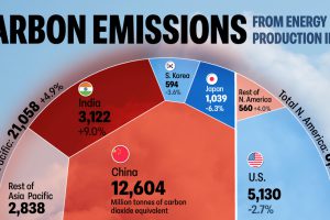
The energy sector is the main contributor of greenhouse gas emissions globally. Which countries’ energy sector emits the most CO2? Read more
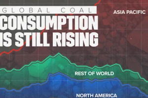
China remains the largest coal consumer, making up 56% of the global total. Read more
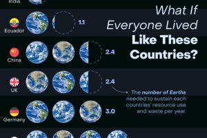
How many Earths would we need if the global population lived like Americans? This infographic answers this question and more. Read more
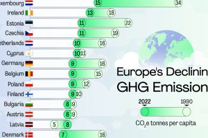
Across the continent, per capita emissions have come down since 1990. But there’s still a long way to go to net zero. Read more