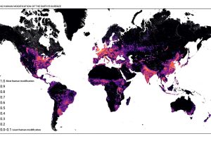
This detailed map looks at where humans have (and haven’t) modified Earth’s terrestrial environment. See human impact in incredible detail. Read more
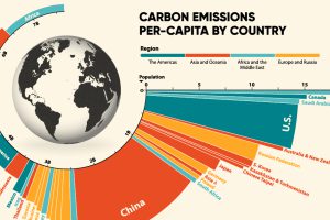
33.6 Gt of CO2 was emitted across the world in 2019. Here we visualize the global per capita CO2 emissions by country and region. Read more

The amount of human-made (or anthropogenic) mass, has now exceeded the weight of all life on Earth, including humans, animals, and plants. Read more
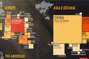
In 2020, solar power saw its largest-ever annual capacity expansion at 127 gigawatts. Here’s a snapshot of solar power capacity by country. Read more
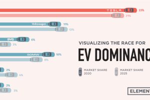
Tesla was the first automaker to hit a $1 trillion market cap, but other electric car companies have plans to unseat the dominant EV maker. Read more

Nuclear power accounted for 10% of global electricity generated in 2020. Here’s a look at the largest nuclear power producers. Read more
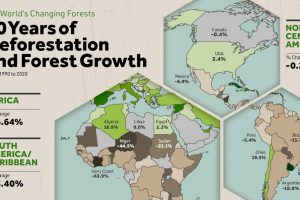
Where are the world’s forests still shrinking, and where are they seeing net gains? We map deforestation by country between 1990-2020. Read more

Global energy transition investment hit $755 billion in 2021. This chart ranks the top 10 countries by energy transition investment. Read more
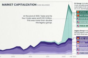
EV valuations have exploded since 2020, dwarfing those of legacy automakers like Ford and Toyota. Gain further insight with this infographic. Read more


