A growing number of companies are taking climate action, but when will they meet their goals? This timeline provides a holistic overview. Read more
In the not so distant future, sustainable investing could structurally change economies. What are the big questions advisers need answered? Read more
Sustainable ETFs surged to $150B in 2020—25x higher than in 2015. What makes up the sustainable ETF universe? Read more
Watch how the energy mix of G20 countries has evolved over the last 50+ years. Read more
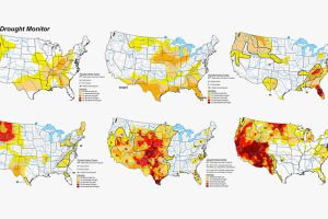
The Western U.S. is no stranger to droughts. But this year’s is one of the worst yet. Here’s a historical look at U.S. droughts since 1999. Read more
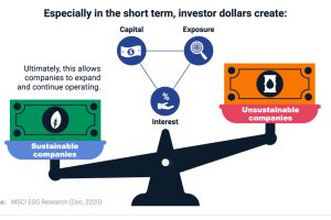
Do sustainable investments make a difference? From carbon emissions to board diversity, we break down their impact across three industries. Read more
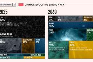
This infographic takes a look at what China’s energy transition plans are to make its energy mix carbon neutral by 2060. Read more

This unique map graphic uses the Great Lakes region as a point of comparison for the top 25 largest lakes in the world. Read more
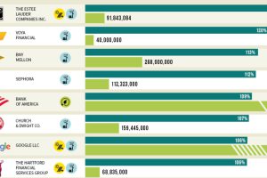
Which U.S. companies use the most green energy as a percentage of total energy used? Here are the 50 highest ranked companies according to the EPA. Read more
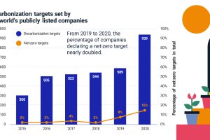
More companies are declaring net-zero emissions targets, but where can they start? Find out the steps companies and investors can take. Read more

