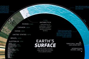
There are 510 million km² of area on the Earth, but less than 30% of this is land. Here’s the share countries make up of the Earth’s surface. Read more
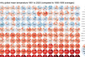
Global Temperature Graph (1851-2020) View the high-resolution of the infographic by clicking here. Since 1880, the Earth’s average surface temperature has risen by 0.07°C (0.13°F) every decade. That number alone… Read more
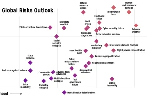
Which risks are top of mind in 2021? We visualize the World Economic Forum’s risk assessment for top global risks by impact and livelihood. Read more
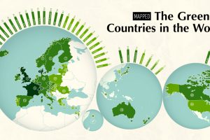
The world’s growing focus on sustainability is a clear sign of the times. This map ranks the 40 greenest countries in the world. Read more
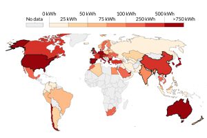
This visualization highlights the growth in solar energy consumption per capita over 54 years. Which countries are leading the way? Read more
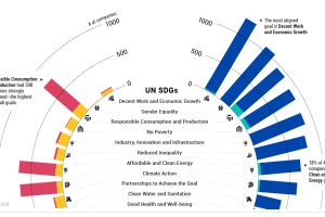
Are companies making progress in meeting the UN Sustainable Development Goals? This tracker shows how companies are measuring up. Read more

Bitcoin mining requires significant amounts of energy, but what does this consumption look like when compared to countries and companies? Read more
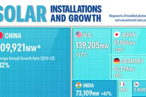
The Asia-Pacific region is leading the solar energy transition as of 2023. Which countries are building the most solar power? Read more
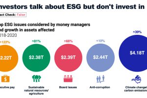
ESG investing continues to break fund inflow records. In this infographic, we unpack five common ESG myths. Read more


