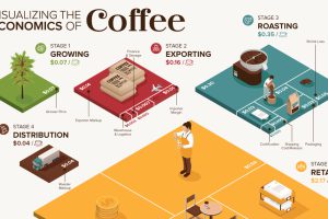
What makes your cup of coffee possible, and how much does it really cost? Here’s how the $200B coffee supply chain breaks down economically. Read more
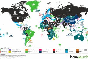
What is the top export in every country? This series of maps explores some of the most influential goods in global trade. Read more
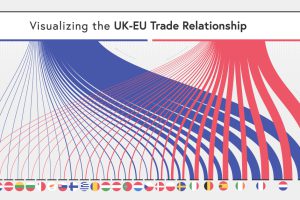
The UK and the EU have recently laid out new terms for their relationship. So how important is the UK’s trade with the EU? Read more
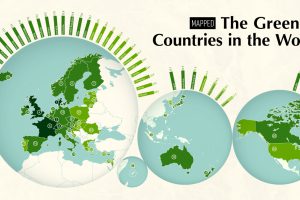
The world’s growing focus on sustainability is a clear sign of the times. This map ranks the 40 greenest countries in the world. Read more
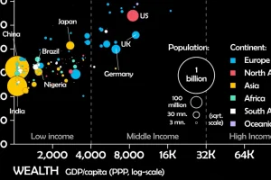
This unique animated visualization uses health and wealth measurements to chart the evolution of countries over time. Read more
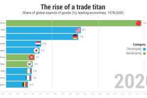
China’s economy today is completely different than 40 years ago; in 2021 the country makes up the highest share of exports globally. Read more
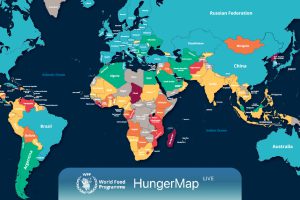
Every day, hunger affects more than 700 million people. This live map from the UN highlights where hunger is hitting hardest around the world. Read more
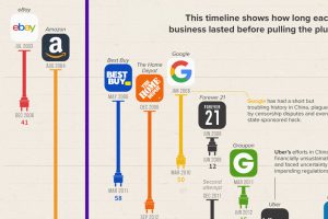
The Chinese market is notoriously difficult for foreign businesses to gain a foothold in. Here, we look at U.S. brands that tried and failed Read more
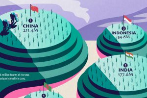
Over half of the world’s population lives on rice as a staple food, but just a few countries dominate global rice production. Read more


