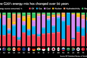
Watch how the energy mix of G20 countries has evolved over the last 50+ years. Read more
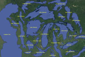
This unique map graphic uses the Great Lakes region as a point of comparison for the top 25 largest lakes in the world. Read more
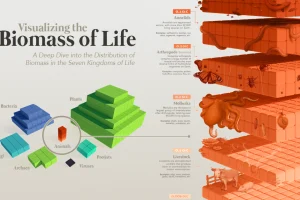
Our planet supports nearly 8.7 million species. We break down the total composition of the living world in terms of its biomass. Read more
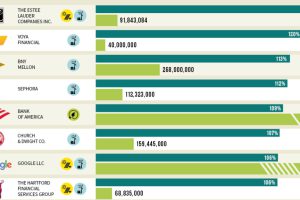
Which U.S. companies use the most green energy as a percentage of total energy used? Here are the 50 highest ranked companies according to the EPA. Read more
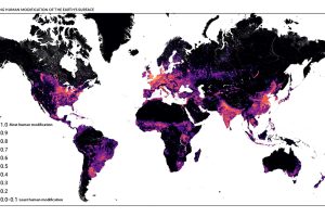
This detailed map looks at where humans have (and haven’t) modified Earth’s terrestrial environment. See human impact in incredible detail. Read more
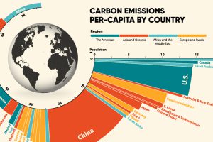
33.6 Gt of CO2 was emitted across the world in 2019. Here we visualize the global per capita CO2 emissions by country and region. Read more
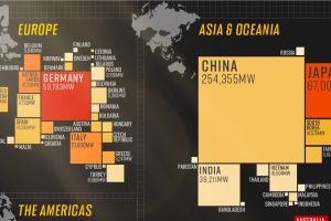
In 2020, solar power saw its largest-ever annual capacity expansion at 127 gigawatts. Here’s a snapshot of solar power capacity by country. Read more
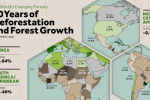
Where are the world’s forests still shrinking, and where are they seeing net gains? We map deforestation by country between 1990-2020. Read more
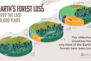
How much has the world’s land use changed over the last 10,000 years, and how have forests been impacted? Read more
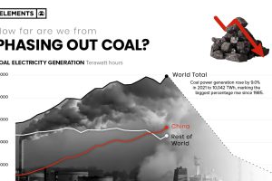
In 2021 coal-fired electricity generation reached all-time highs, rising 9% from the year prior. Here’s what it’d take to phase it out of the energy mix. Read more

