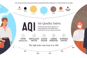
This graphic breaks down how the air quality index is measured, and looks at which regions are hardest hit by atmospheric pollution and wildfires. Read more
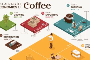
What makes your cup of coffee possible, and how much does it really cost? Here’s how the $200B coffee supply chain breaks down economically. Read more
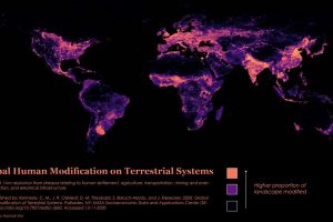
Nearly 95% of the Earth’s surface shows some form of human modification, with 85% bearing evidence of multiple forms of human impact. Read more
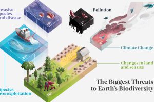
Earth’s biodiversity has seen a massive decrease over the years. What’s driving this loss, and which regions have been impacted the most? Read more
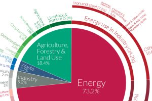
World emissions have reached almost 50 billion tonnes of greenhouse gases (GHGs) and counting. Which major sectors do they originate from? Read more
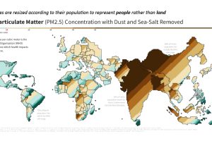
This population-weighted cartogram shows the countries with the worst air pollution, based on fine particulate matter (PM2.5) concentration. Read more
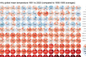
Global Temperature Graph (1851-2020) View the high-resolution of the infographic by clicking here. Since 1880, the Earth’s average surface temperature has risen by 0.07°C (0.13°F) every decade. That number alone… Read more
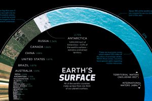
There are 510 million km² of area on the Earth, but less than 30% of this is land. Here’s the share countries make up of the Earth’s surface. Read more
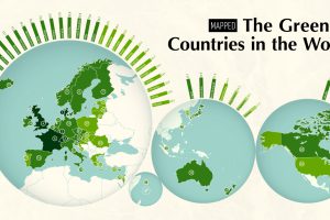
The world’s growing focus on sustainability is a clear sign of the times. This map ranks the 40 greenest countries in the world. Read more
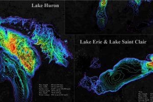
The five Great Lakes account for 21% of the world’s total freshwater. This bathymetric visualization dives into just how deep they are. Read more

