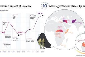
Aside from the obvious human toll, violence also hurts productivity and wealth creation. We visualize the real economic impact of violence in these charts. Read more
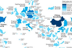
This map re-sizes countries based on the amount of goods they export abroad, giving a clear look at the world’s biggest exporters of 2017. Read more

With protectionist policies gaining momentum and a global trade war underway, we look at the world’s largest importers of goods in 2017. Read more
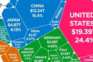
Latest estimates put the world economy at about $80 trillion in nominal GDP. Here is how each individual country stacks up in terms of size. Read more
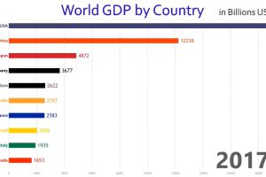
This rapid-paced animation shows year-by-year changes in GDP for the world’s 10 largest economies over the course of 57 years. Read more
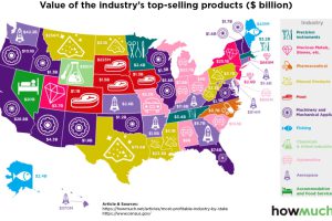
Which industries reign supreme in the United States? This map breaks down the most profitable industry, state by state. Read more
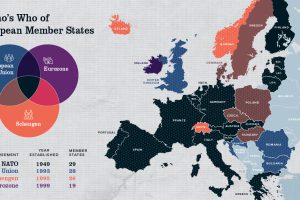
Europe has members in at least four major treaty groups. This map shows how these groups fit into the big picture of Europe’s member states. Read more
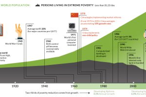
This interactive graphic shows the poverty rate of every state, and also how poverty levels have changed over time according to the U.S. Census Bureau. Read more
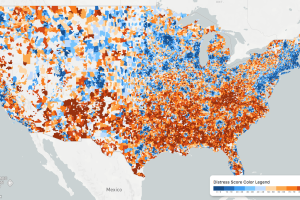
While the U.S. economic picture remains quite rosy, things change quickly when you zoom to the local level. This map shows the country’s distressed communities. Read more
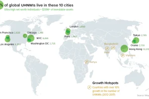
A data-driven snapshot of global wealth distribution. The average person around the world is doing better, but big-picture inequality is still staggering. Read more

