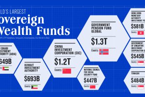
To date, only two countries have sovereign wealth funds worth over $1 trillion. Learn more about them in this infographic. Read more
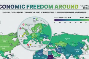
The global average economic freedom score is at the highest its been in 27 years. Here we map the economic freedom score of nearly every country. Read more
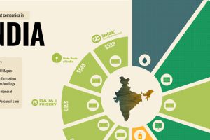
What are the biggest companies in India, one of the largest and most populated countries in the world? Read more

Tracking the companies that have gone public in 2021, their valuation, and how they did it. Read more
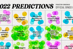
We analyzed 300+ articles, reports, and interviews to answer the question: is there any consensus on 2022 predictions? Here are the results. Read more
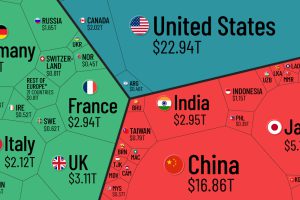
Which countries and regions contribute the most to the world economy? In this infographic, we break down all $94 trillion of global GDP by country. Read more

Global debt reached $226T by the end of 2020 – the biggest one-year jump since WWII. This graphic compares the debt-to-GDP ratio of various countries. Read more
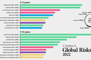
Which risks are top of mind in 2022? We visualize the World Economic Forum’s global risk assessment for top risks by impact and livelihood. Read more
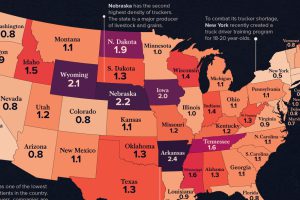
See how America’s 1.8 million truckers are distributed across the nation in these two heatmap visualizations. Read more


