

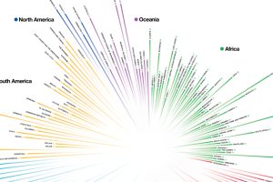
How do countries around the world compare in terms of age? This compelling visualization shows the median age for every country in the world. Read more
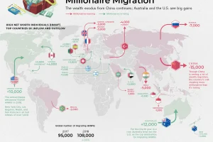
Which countries are magnets for the world’s rich, and which countries are seeing a wealth exodus? Mapping the migration of the world’s millionaires. Read more
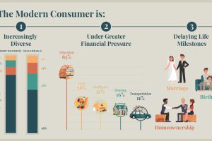
We all have a stereotypical image of the average consumer – but is it an accurate one? Meet the modern consumer, and what it means for business. Read more
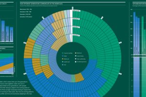
Summing up the differences in how generations approach work, including on topics such as communication, motivation, and employer loyalty. Read more
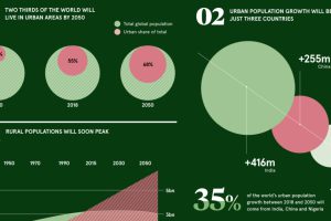
These pivotal trends show how urban demographics are aiding in the transition to a very different economic and investment landscape. Read more
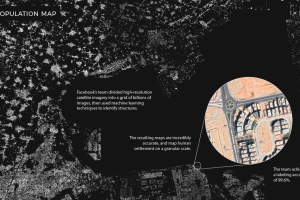
Machine learning technology is allowing researchers at Facebook to map the world population in unprecedented detail. Read more
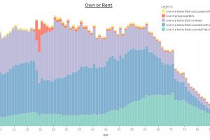
This interactive infographic allows you sort data on the U.S. population using a variety of topics, to see how Americans differ by age. Read more
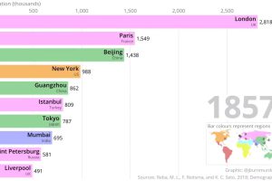
This two-minute animation shows changes in the last 500 years of historical rankings for the world’s 10 most populous cities. Read more
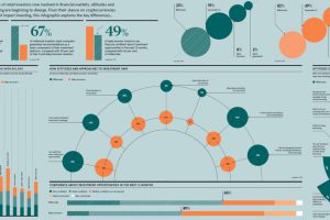
Each generation was shaped by unique circumstances, and these differences translate directly to the investing world as well. Read more
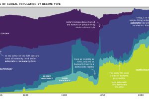
At the start of the 19th century, less than 1% of humanity lived under democratic rule. See how systems of government have changed over the last 200 years. Read more