

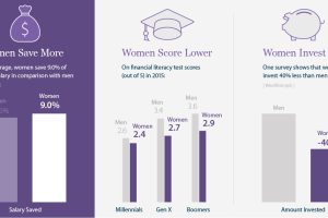
Women are better at saving money, but invest less of it – this infographic looks at the specific needs of women in investing and how to better serve them. Read more

This animation shows the population density of U.S. counties between 1790 and 2010, showing the westward expansion of the country’s population. Read more
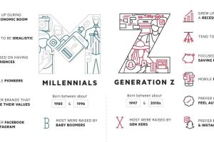
As Millennials enter their early-30s, the focus is now shifting to Generation Z – a group that is just starting to enter the workforce for the first time. Read more
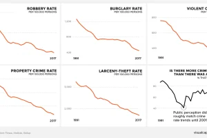
There’s a persistent belief across America that crime is on the rise. This graphic amalgamates crime rate data from the FBI to show a very different reality. Read more
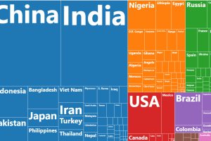
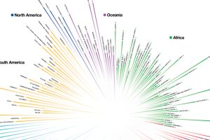
This chart resizes the world’s countries based on population, while organizing them based on region. See where all 7.5 billion people live. Read more
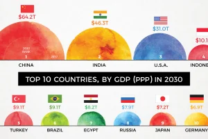
By 2030, the complexion of the global economy could look very different. This animation shows how the world’s biggest economies will change over time. Read more
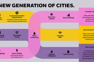
By 2050, there will be 2.5 billion more people living in cities than today. How is rapid urbanization set to impact investors and the global economy?v Read more
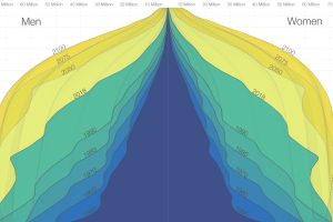
The world is in the midst of a notable demographic transition. Here’s how the world population pyramid will change as we close in on the year 2100. Read more
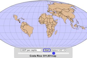
How does the world map change if it gets assembled based on the size of economies, in ascending order of GDP or GDP per capita? Read more
How do countries around the world compare in terms of age? This compelling visualization shows the median age for every country in the world. Read more