

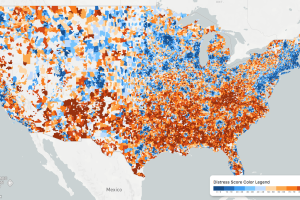
While the U.S. economic picture remains quite rosy, things change quickly when you zoom to the local level. This map shows the country’s distressed communities. Read more
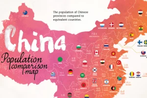
With 1.4 billion people living in the country’s 33 distinct regions, each of China’s provinces has a population that is equal to that of a major country. Read more
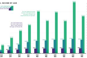
What is the relationship between age and income level? We visualize the data and compare it to commonly held beliefs on the topic. Read more
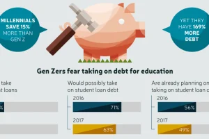
Gen Z saw their older friends take on massive amounts of debt, while struggling to secure stable jobs – and now they are learning from those mistakes. Read more
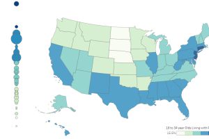
It’s estimated that 34.5% of young adults (18-34 years old) in the U.S live at home with their parents. Here’s how it varies by state, as well as over time. Read more

Since 1830, there have been four major waves of U.S. immigration – and this unique video depicts the influx of immigrants as rings in a tree trunk. Read more
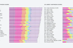
What contributes to happiness? These charts break down global happiness scores – how does your country fare, and how has it changed over ten years? Read more
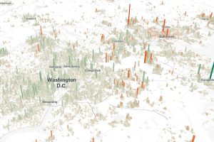
Cities are constantly evolving over time. These 3d graphics visualize both growth and decline with a focus on North American cities from 1990-2015. Read more
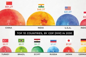
According to projections by a prominent multinational bank, 7 of the world’s 10 largest economies will be in emerging markets in 2030. Read more
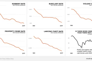
There’s a persistent belief across America that crime is on the rise. This graphic amalgamates crime rate data from the FBI to show a very different reality. Read more