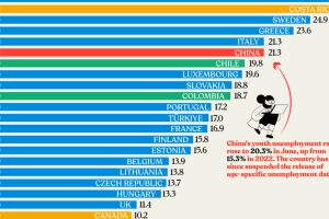
Nearly three years after COVID-19 first hit, youth unemployment in some countries, like China, has risen sharply. Read more

The world’s millionaire population has more than doubled in the last decade between 2012 and 2022. We visualize these numbers here. Read more

This map explainer looks at the Gaza Strip from a structural point of view, delving into geography, infrastructure, demographics, and more. Read more
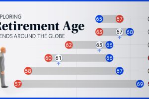
We chart current and effective retirement ages for 45 countries, revealing some stark regional differences. Read more

Why are the number of North Korean defectors decreasing? We cover the number of defectors by year and map their perilous escape routes. Read more

The global middle class is expected to grow by 113 million people in 2024. We visualize this growth by country and region. Read more
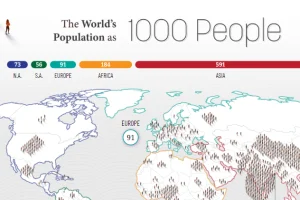
How would all the people in the world be spread out if there were only 1,000 people on Earth? This interactive map examines the breakdown. Read more
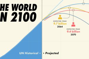
Population projections from the UN suggest that there will be over 10 billion people by 2060, though other organizations disagree. Read more
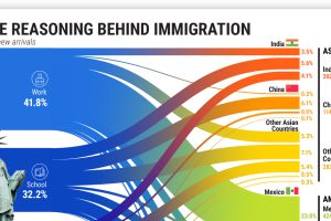
More than 45 million American residents were immigrants in 2021, having moved for various reasons. Read more
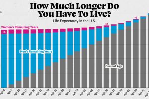
Visualizing the number of years left to live for Americans at every age, reveals the broader trends in American life expectancy. Read more

