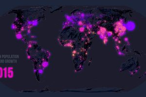
Few global trends have matched the profound impact of urbanization. Today’s map looks back at 70 years of movement in over 1,800 cities. Read more
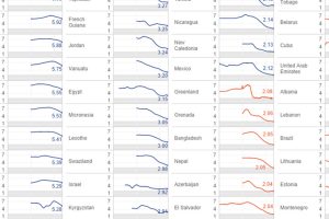
Global fertility has almost halved in the past century. Which countries are most resilient, and which have experienced the most dramatic changes over time? Read more
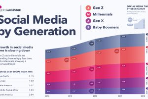
Every generation has the same desire for connection, but the way in which we connect over social media differs across age groups and regions. Read more

Today’s infographic explores how the millennial generation are fueling the short-term rental industry—is it a passing fad or a shift in buyer behavior? Read more
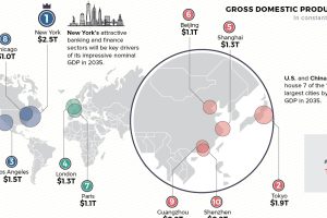
Cities are heavy hitters in the global economy. Where will the top 10 cities be in 2035—based on GDP, population, and annual growth? Read more
We map out which parts of the world are losing people to emigration basedon 2023 data. Noticeably, high income countries are underrepresented. Read more
This visualization ranks the top 15 countries of origin for people who gained U.S. green cards (permanent residency) in 2022. Read more
More people doesn’t automatically equate to more Olympic medals, as some of the world’s most populous countries have found out over the years. Read more
There’s an east-west divide when it comes to Europe’s population growth in the last 30 years. And it’s very apparent in this map. Read more
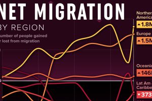
We visualized net migration statistics from the United Nations to gain insight into the flow of people globally. Read more

