

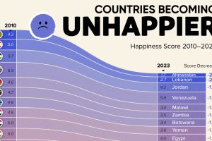
Tracking Gallup survey data for more than a decade reveals some countries are witnessing big happiness declines, reflecting their shifting socio-economic conditions. Read more

Tracking Gallup survey data for more than a decade reveals insights into the regions seeing happiness gains. Read more
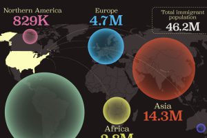
This map shows which regions U.S. immigrants came from, highlighting Asia and Latin America as the biggest sources. Read more
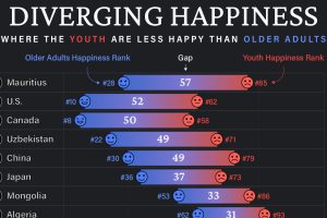
Conventional wisdom says that young adults (those below 30) tend to be the happiest demographic—but this is not true for these countries. Read more
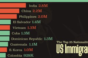
Mexico is the largest source of immigrants to the U.S., with almost 11 million immigrants. Read more
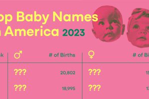
Brayden, Kayden, and Jayden might be in the internet spotlight, but America’s most popular baby names in 2023 are some perennial favorites. Read more

This graphic shows the annual births per 1,000 people in the world’s six most populous countries. Read more
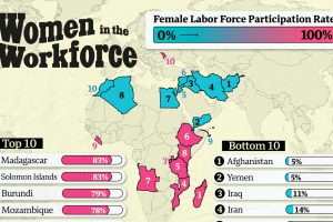
More women in the workforce can indicate a shift towards women having more economic opportunities and facing fewer barriers to working outside the home. Read more
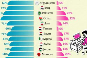
Tracking the difference between male and female labor force participation rates reveals large gender disparities for women at work. Read more

EU emigration patterns don’t see the spotlight as often as its immigration numbers. So, here are the top source countries for EU emigrants. Read more