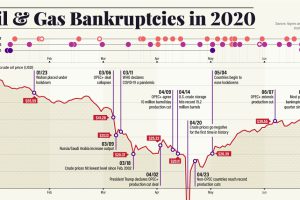
Dropping crude prices and a worsening pandemic have led to a growing wave of energy bankruptcies. Here’s what that fallout looks like. Read more
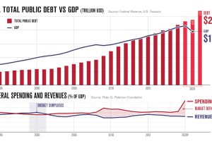
America’s debt recently surpassed $27 trillion. In this infographic, we peel back the layers to understand why it keeps on growing. Read more
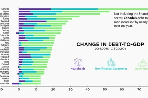
The battle against the COVID-19 pandemic has resulted in heightened debt-to-GDP levels across all sectors and countries. Read more
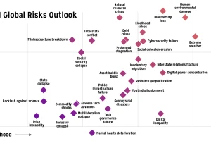
Which risks are top of mind in 2021? We visualize the World Economic Forum’s risk assessment for top global risks by impact and livelihood. Read more
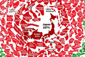
After an unprecedented borrowing spree in response to COVID-19, what does government debt look like around the world? Read more
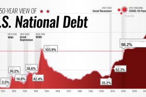
This interactive visual shows how the U.S. national debt has fluctuated since 1900, as well as projections all the way to 2050. Read more

Global debt reached $226T by the end of 2020 – the biggest one-year jump since WWII. This graphic compares the debt-to-GDP ratio of various countries. Read more

Robust growth in mortgages has pushed U.S. consumer debt to nearly $16 trillion. Click to gain further insight into the situation. Read more


