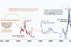
Interest rates sit near generational lows — is this the new normal, or has it been the trend all along? We show a history of interest rates in this graphic. Read more
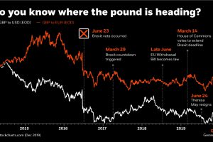
This infographic uses the recent Brexit-related volatility of the British pound to illustrate how currency risk can impact an investor’s portfolio. Read more
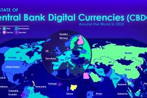
Central bank digital currencies are coming, but progress varies greatly from country to country. View the infographic to learn more. Read more
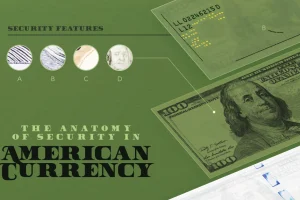
How can you tell a fake $100 bill from a real one? In this visual we break down the anatomy and security features of American money. Read more
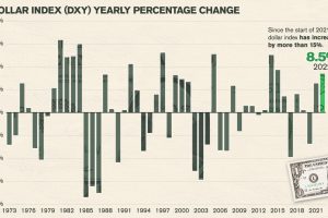
In a volatile and difficult year for many assets and equities, how have the world’s major currencies performed against the U.S. dollar? Read more
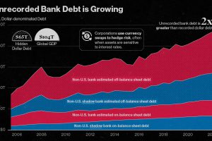
Since 2008, the value of unrecorded dollar debt has doubled. Here’s why this is increasing risk in global financial markets. Read more
We breakdown $11.5 trillion in foreign exchange reserves to highlight the world’s top reserve currencies in 2024. Read more


