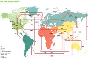
Visualizing the Flow of Oil Around the World

Every day, 93 million barrels of oil are consumed by the global economy. How does this oil change hands? This map visualizes the global oil trade. Read more

The World’s Most Famous Case of Deflation

The Great Depression was the most severe economic depression ever experienced by the Western world. It was also the most famous case of deflation. Read more
Currency and the Collapse of the Roman Empire

How currency debasement, soaring costs, and overtaxing helped lead to the collapse of Ancient Rome’s economy and empire. Read more

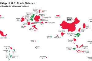
The World Map of the U.S. Trade Deficit

The U.S. has run a trade deficit for 40 years now. Where does that net foreign spending go? This map visualizes the data from 2015. Read more

Life and Times During the Great Depression

Banks collapsed, and millions were out of work. This infographic, part 2 of 2, details the extent of The Great Depression as well as the deflationary cycle. Read more

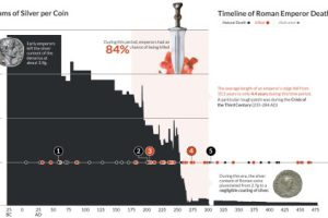
Chart: Deaths of Roman Emperors vs. Coinage Debasement

This data visualization plots the causes of death of Roman Emperors against the content of silver coins. Read more

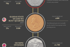
Making Cents of Rare Coins

This infographic provides an introduction to rare coins, including some of the bizarre stories behind coins that are highly sought-after by collectors. Read more

Charted: The Death of Cash Transactions Around the World

As credit cards and digital wallets increase in popularity, the world is seeing the death of cash as means of transaction. Read more

The Shift to a Cashless Society is Snowballing

The world is increasingly becoming a cashless society. See the progress in this monumental shift, along with the pros and cons behind the death of cash. Read more

An Inside Look at the World’s Biggest Paper Gold Market

Everything you need to know about the secretive London gold trade, where 5,500 tonnes of paper gold are exchanged each day and spot prices are set. Read more