

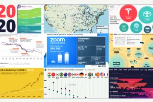
These 20 charts, maps, and visualizations help capture what happened in a tumultuous year around the globe. Read more
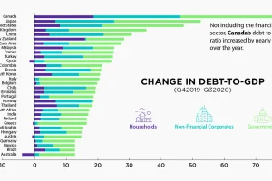
The battle against the COVID-19 pandemic has resulted in heightened debt-to-GDP levels across all sectors and countries. Read more

This graphic compares consumers’ most loved brands before the COVID-19 pandemic to their most loved brands during the pandemic. Read more
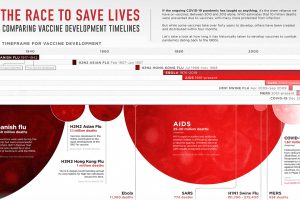
This graphic looks at how long vaccine development has historically taken for pandemics dating back to the 1900s. Read more

Visualizing the share of COVID-19 vaccines purchased by different countries and the companies that are manufacturing them. Read more
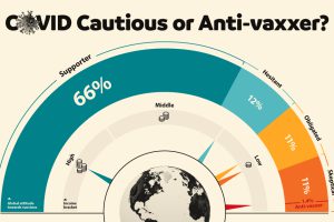
This graphic visualizes global attitudes to vaccines categorized into five segments including anti-vaxxers and COVID cautious. Read more
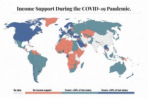
The need for income support during COVID-19 has been vast. This map visualizes different levels of income support around the world. Read more
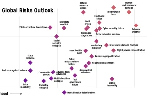
Which risks are top of mind in 2021? We visualize the World Economic Forum’s risk assessment for top global risks by impact and livelihood. Read more
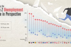
COVID-19 has impacted everyone, but one generation is taking it harder than the others. This graphic reveals the Gen Z unemployment rate. Read more
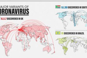
New variants of COVID-19 are spreading fast around the world. Here’s a look at the 3 major ones and how they differ from one another. Read more