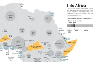
Over the last decade, China has poured billions of dollars of investment into the African continent. See this information visualized. Read more
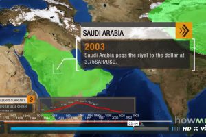
The U.S. dollar is the dominant reserve currency, making up 64% of global reserves. How did this come to be, and what does the future hold for the dollar? Read more
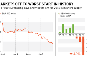
In this chart and post, we show why markets are off to their worst start in history. We also look at recent S&P 500 starts to show an interesting trend. Read more
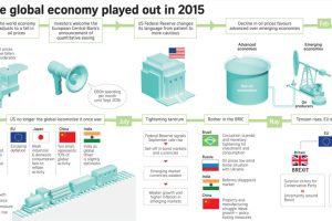
This infographic recaps economic events and sentiment in 2015. Should investors approach the new year with renewed optimism or brace for volatility? Read more
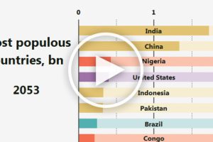
This animation shows how the ranking for the most populous countries in the world will change over more than 100 years. Read more
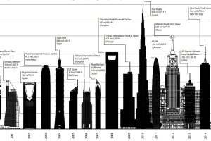
These visualizations show how the tallest skyscraper of 2015 compares to other years, as well as other buildings completed last year. Read more
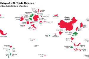
The U.S. has run a trade deficit for 40 years now. Where does that net foreign spending go? This map visualizes the data from 2015. Read more
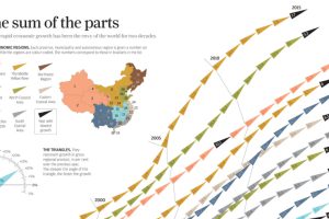
China’s economic miracle over the last 20 years is the sum of its parts, with each region of the country contributing to growth in different ways. Read more
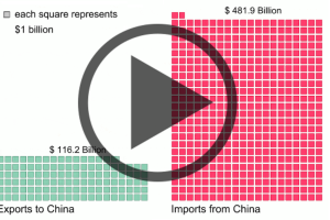
Donald Trump claims that the U.S. keeps losing to China in trade. His numbers are technically untrue, but they’re not far off. Read more
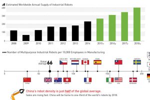
There will be 1.3 million new industrial robot installations between 2015 and 2018. Read more

