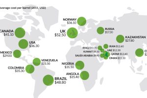
Brexit happened and markets are turned upside-down. However, this may only be just the beginning… Read more
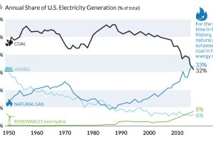
The decline of coal has been swift and unprecedented. We show in these three charts how it went from American energy hero to zero. Read more

Why is the South China Sea so important, and what is the basis for the ruling against China’s territorial claims? This in-depth graphical explainer tells it all. Read more
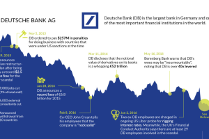
The fate of Germany’s largest bank appears to be sealed. This timeline shows the fall of Deutsche Bank, one of Europe’s most crucial financial institutions. Read more

The roller coaster for Yahoo finally ends. This timeline shows where Yahoo execs went wrong during the company’s 20 year history. Read more
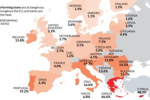
Despite the potential negative economic consequences, there is one reason a Brexit makes sense: non-performing loans and Europe’s troubled banking sector. Read more
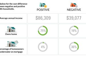
The differences between America’s poorest homes – those with negative wealth – and their positive counterparts are stark and numerous. Read more
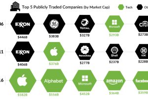
What are the largest companies by market cap, and how have they changed over the years? This chart shows them, while also presenting a broader narrative. Read more
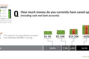
A recent survey shows that most millennials are living paycheck to paycheck. This chart looks at their savings, as well as differences between subgroups. Read more


