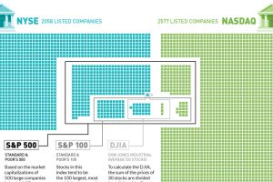
Plotting the 4,500+ companies on the NYSE and NASDAQ to show how the S&P 500, S&P 100, and Dow are derived. Read more
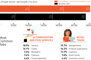
So far in 2016, a total of 589k private sector jobs have been created by the U.S. economy. However, 51% of these jobs are in two of the lowest paid… Read more
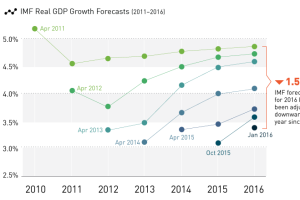
After five years of downward revisions to global real GDP growth, will next week’s IMF economic report finally be grounded in reality? Read more
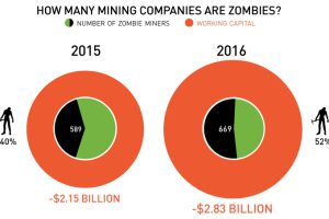
Mind-blowing fact: 52% of Canadian-listed mining companies are now considered “zombies”, or companies with negative working capital. Read more
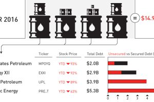
April was a record-setting month for bankruptcies in the oil patch. We put the 11 bankruptcies and $15 billion of outstanding debt in context. Read more
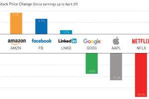
Earnings season has been a roller coaster for the world’s biggest tech companies. We sum up the action in today’s chart. Read more
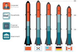
No one knows the size of China’s debt bomb. Here we look at estimates of the payload as well as what could potentially ignite the fuse. Read more
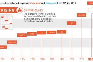
Want to know what’s trending with entrepreneurs in the startup trenches? Today’s chart shows what’s hot (and not) in early stage tech. Read more

How do millennials spend their discretionary income in comparison to other groups? We dive into the latest survey results on millennial spending habits. Read more
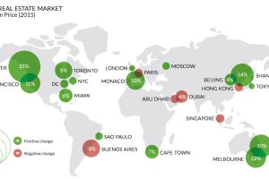
Which world-class cities are the ultra-rich flocking to? Which are they avoiding? The lopsided market for luxury properties helps tell the tale. Read more

