

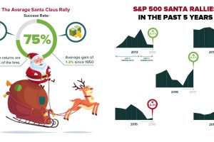
Here’s the historical data on the fabled Santa Claus Rally that occurs in the stock market, and how things are shaping up so far this holiday season. Read more
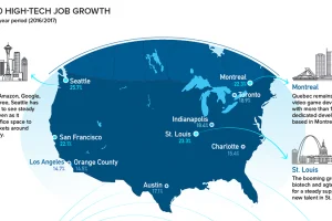
Silicon Valley is no longer the only place to be for a career in tech. Here are the fastest growing tech markets across North America, and the up-and-comers. Read more
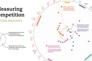
Which resource markets have healthy levels of competition, and which are more monopolistic? This chart shows the global level of competition for 33 minerals. Read more
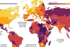
Which countries are the most (and least) corrupt? This world map shows the figures for the Corruption Perceptions Index (CPI) for 2018. Read more
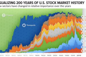
How has the composition of the market changed over time? This incredible chart plots U.S. stock market sectors over 200 years to reveal how much it’s changed. Read more
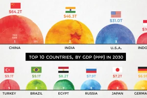
According to projections by a prominent multinational bank, 7 of the world’s 10 largest economies will be in emerging markets in 2030. Read more
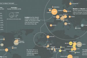
What cities are the world’s ultra-rich flocking to? This map looks at ultra high net worth individual (UHNWI) growth rates in cities around the world. Read more
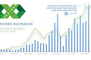
In 2018, companies announced over $1 trillion in stock buybacks. We explain what the proponents and detractors of buybacks are arguing about. Read more
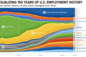
How has the share of total jobs changed over time by sector? This compelling chart shows over 150 years of U.S. employment history by industry. Read more
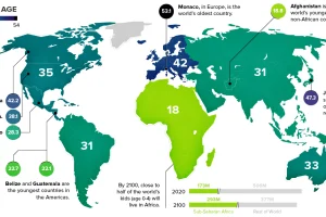
This chart takes a look at the median age of every continent, while also breaking down the youngest and oldest countries in the world. Read more