
Most of us will experience impostor syndrome at some point in our careers. This flow chart helps identify which of 5 archetypes you fit with. Read more
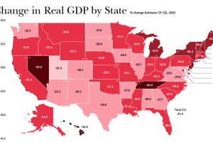
In just a few months, the U.S. economy reeled from COVID-19. As real change in GDP suffered, which states and industries were the hardest-hit? Read more
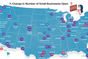
Across the U.S., 37% of small businesses are still shuttered. This map demonstrates how uneven that closure rate is in cities around the country. Read more
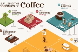
What makes your cup of coffee possible, and how much does it really cost? Here’s how the $200B coffee supply chain breaks down economically. Read more

Nearly 6,000 satellites circle our tiny planet. About 60% are space junk, 40% are operational—and hundreds more are launched every year. Read more
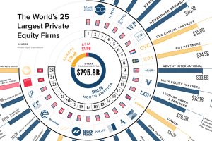
How big is private equity? We show funds raised by the largest 25 private equity firms over the last five years and their notable investments. Read more
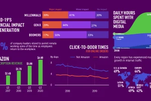
In some cases, COVID-19 has sped up societal and economic trends that were already in motion. Here we examine five examples. Read more
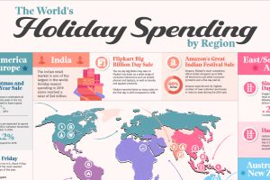
This graphic illustrates some of the largest and most anticipated retail holidays by region and explores their origins. Read more

By embracing uncertainty and making timely pivots, we visualize the bizarre origin stories of the most successful tech companies today. Read more


