


Believe it or not, we’ve been swiping for a decade now. Here’s a look at ten years of Tinder’s business in the world of dating apps. Read more
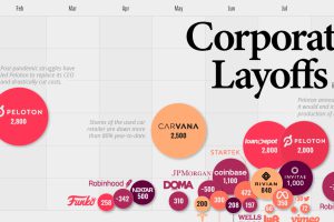
This infographic highlights the accelerating pace of layoffs so far in 2022, as businesses cut costs ahead of a potential recession. Read more

Extra, extra read all about it—these 25 popular U.S. newspapers are trending downwards in their daily print circulation year-over-year. Read more
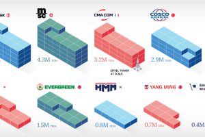
In this infographic, we rank the world’s 10 largest maritime shipping companies by container capacity and fleet size. Read more
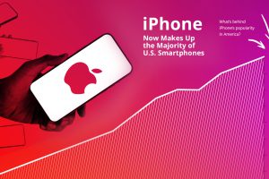
Apple’s flagship device has captured a modest 16% of the global market, and Android dominates globally. Why do so many Americans keep buying iPhones? Read more
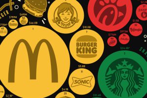
America has hundreds of options for quick and convenient food. But which fast food brands are the most popular, in terms of sales? Read more
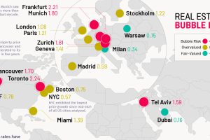
A global look at which cities have the most overheated real estate markets. Toronto shows the highest bubble risk in 2022. Read more

From Twitter to TikTok, this infographic compares the universe of social media and messaging platforms by number of monthly active users. Read more
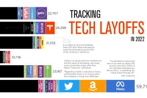
Mass layoffs in the tech industry have accelerated as the end of 2022 approaches. See which companies let people go in 2022. Read more
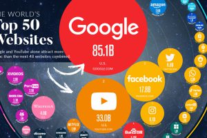
In this visualization, we rank the top 50 websites that receive the most internet traffic, from Google to CNN. Read more