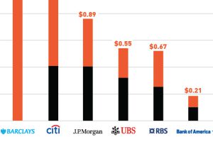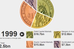
This interactive finance infographic shows the evolution of investment bank fees from 1996 until today. Read more
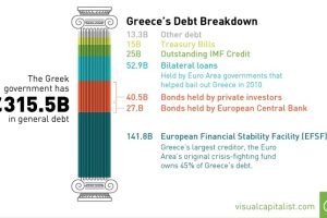
Today’s Chart of the Week looks at Greece’s debt and which countries and entities are on the hook if a default takes place. Read more
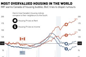
The Economist and IMF both are warning Canada about a housing bubble, while the Bank of Canada tries to dispel all fears. Read more
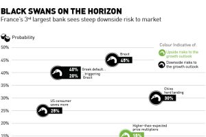
France’s third largest bank, SocGen, sees more negative black swan events on the horizon than potential upside. Read more
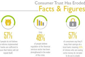
Consumer trust has eroded in the banking system, with only 32% of people trusting their retail bank. Why is trust at an all time low and how can it be… Read more

This infographic compares 14 different conventional and alternative asset classes during five times of distress. See the history of crisis investing here. Read more

The performance of this elite group of investors was the worst since the 2008 Financial Crisis. See who made the Hedge Fund Rich List in this infographic. Read more
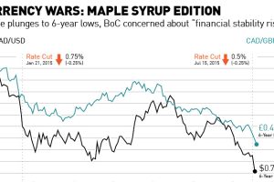
With the Canadian dollar plunging to 6-year lows after the second rate cut in six months, we look at the Maple Syrup version of a currency war. Read more
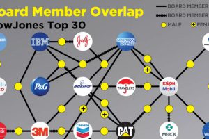
The most powerful corporations in America are intimately connected. Their boards and executives are intertwined in what looks like a spider web. Read more


