In December 2023, we publicly launched Voronoi, our free new data discovery app!
The initial response from both users and creators has been incredible. We now have millions of in-app views, and there are already more than 1,500 interesting visualizations to discover, many of which will never be published on Visual Capitalist.
For that reason, we’ve chosen to highlight some of the most popular visualizations and creators from August in this roundup. To see them and many others, make sure to download the app!
Let’s take a look at a popular creator worth highlighting, a top “Editor’s Pick” of the month, and also the most popular and most commented on visuals.
POPULAR CREATOR
Neomam Studios
Visual Capitalist is just one of many creators on Voronoi.
In fact, it’s a data storytelling platform with many world-class creators with insightful visualizations, like Neomam Studios.
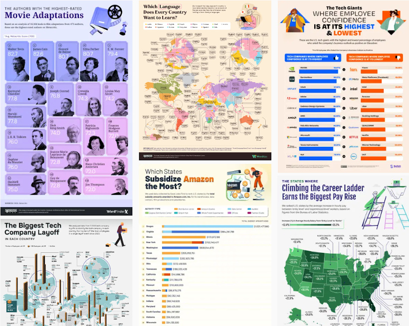
Joining Voronoi this summer, here are just some of the data-driven creations submitted by Neomam over the last month or two:
- The biggest tech company layoffs since 2020, by country
- How America subsidizes Amazon by U.S. state
- Authors with the highest-rated movie adaptions
- Where employee confidence is highest and lowest, among tech giants
Make sure to follow Neomam Studios on Voronoi today to see many charts, maps, and visualizations on a wide range of exciting topics.
 View all visuals from Neomam on Voronoi today.
MOST VIEWED
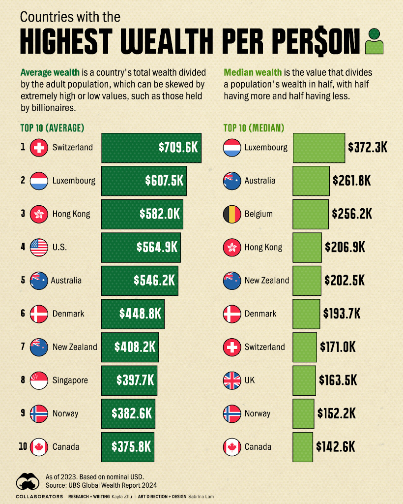
Ranked: The Countries With the Highest Wealth per Person
Wealth per person is an interesting metric, and can be looked at a number of ways.
In the following chart, Visual Capitalist breaks it down by both average and median wealth per person.
By comparing both average and median wealth, the visualization shows how slightly different pictures can be painted based on the metric chosen.
For example, average wealth per person is heavily influenced by both the top and bottom of the wealth distribution, while the median cuts through the exact middle of the population while ignoring the extremes.
 Get the data behind this visual on Voronoi today.
EDITOR’S PICK
Organization Megadonors to the 2024 Election
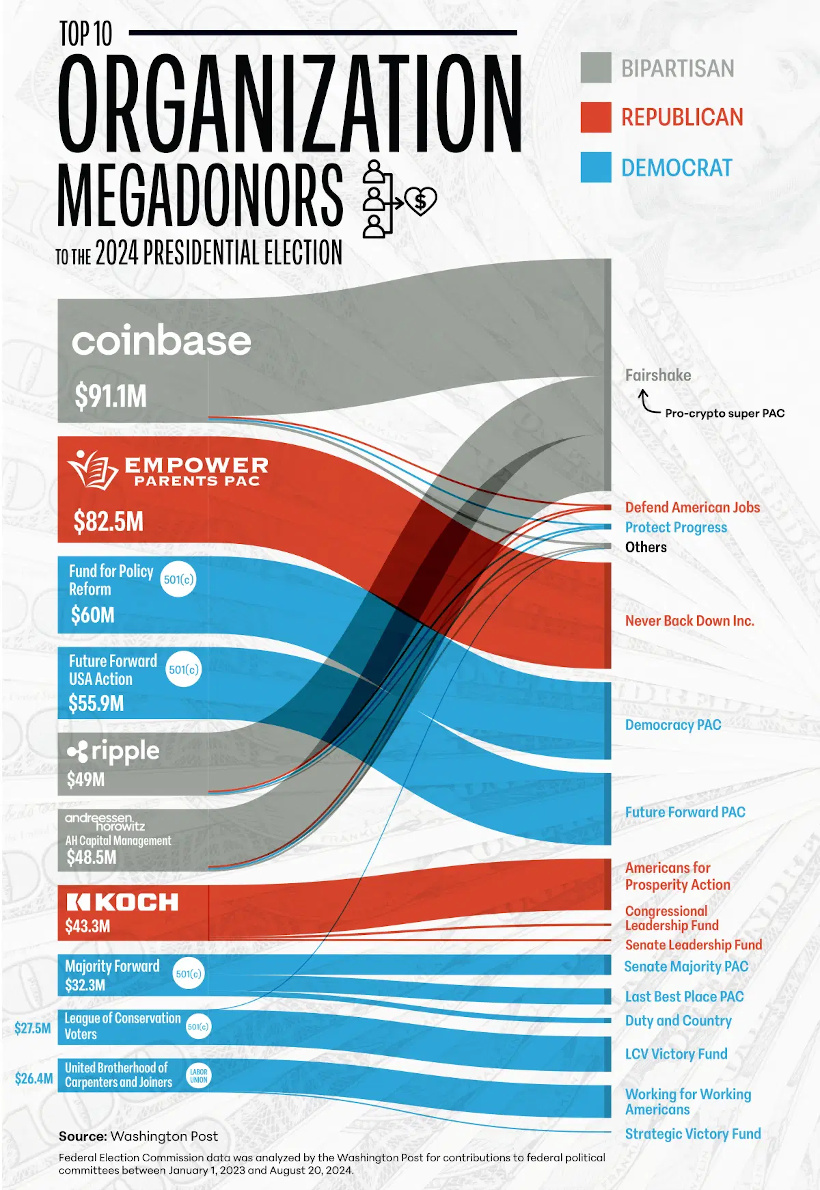
One of the recent picks in our Editor’s Pick feed on the app is from creator Julie Peasley, and it shows organizational megadonors for the U.S. election.
What we thought was interesting to see in this visualization was that various cryptocurrency organizations and their backers (Coinbase, Ripple, a16z) have been aggressive donors to non-partisan, pro-crypto super PACs like Fairshake.
Julie’s also broken down the biggest individual megadonors in the U.S. election as well.
 Get the data behind this visual on Voronoi today.
MOST DISCUSSED
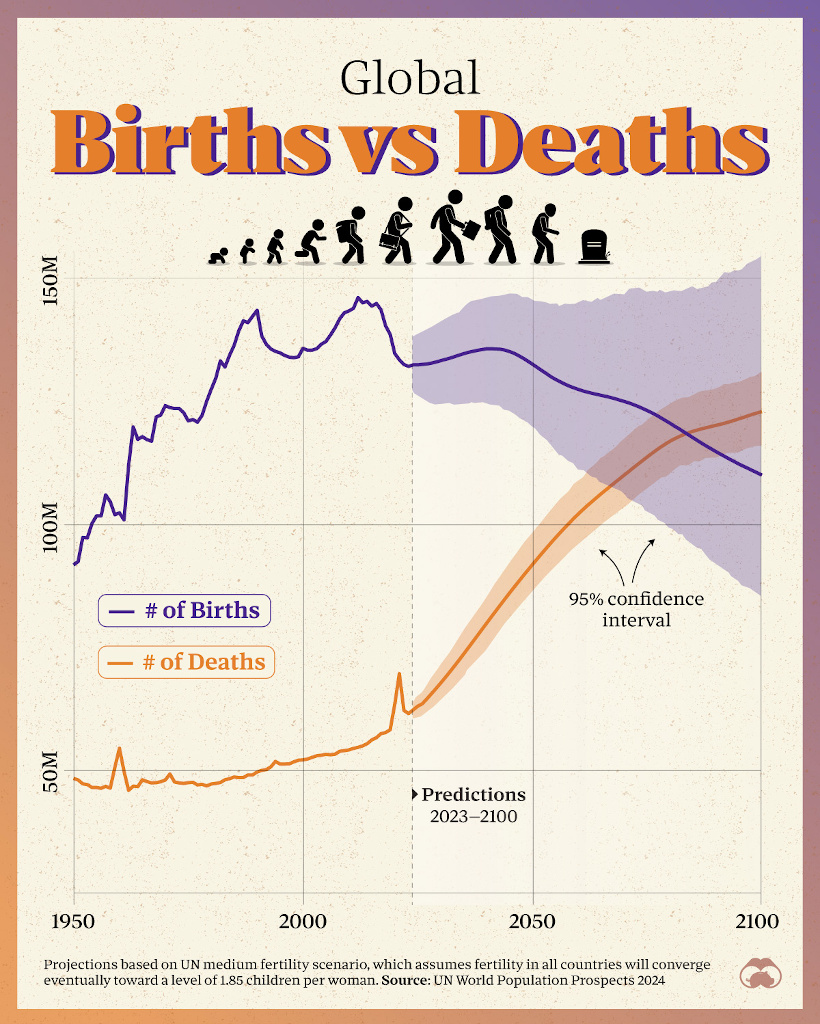
When Will the Global Population Start to Shrink?
The global population has been in a rapid expansion since the Industrial Revolution.
But could that wave be receding?
This visualization by Visual Capitalist was the most talked about this month on Voronoi, and it shows the new UN base case for global population projections.
While much is still in the air, as you can see by the confidence intervals, the base case puts global population growth at a turning point in the year 2084—with deaths exceeding global births at that point in time.
 To join the conversation, join Voronoi today.


