

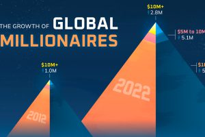
The world’s millionaire population has more than doubled in the last decade between 2012 and 2022. We visualize these numbers here. Read more
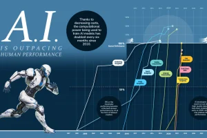
Progress in computation ability, data availability, and algorithm efficiency has led to rapid gains in performance for AI vs humans. Read more
Antarctica’s ice extent has reached record lows. This visual details and maps Antarctica sea ice loss over the last two years. Read more
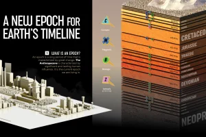
We visualize Earth’s history through the geological timeline to reveal the planet’s many epochs, including the Anthropocene. Read more

The generative AI boom is powered by processors. How have AI chip sales grown over the last two years among Nvidia vs AMD vs Intel? Read more
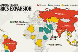
We provide a data-driven overview of how the recent BRICS expansion will grow the group’s influence and reach. Read more
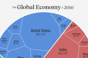
Asia is expected to represent the world’s largest share of real GDP in 2050. See how this all breaks down in one chart. Read more
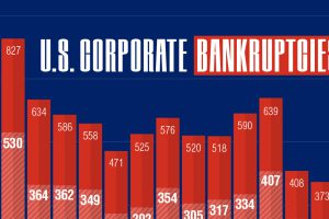
In 2023, over 400 companies have folded. This graphic shows how corporate bankruptcies are growing at the second-fastest rate since 2010. Read more
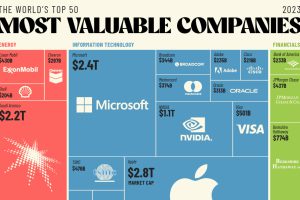
The world’s 50 most valuable companies represent over $25 trillion in market cap. We break this massive figure down by company and sector. Read more
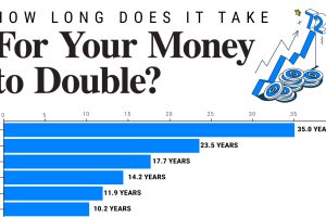
Since 1949, the S&P 500 has doubled in value 10 times. We show how long it takes to double your money across a range of annualized returns. Read more