

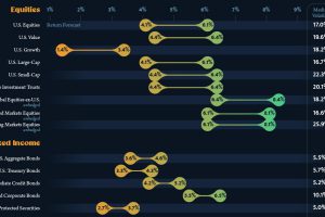
This infographic visualizes 10-year annualized forecasts for both equities and fixed income using data from Vanguard. Read more

There’s more to consider than the price tag when purchasing a house. This ranking reveals the most affordable U.S. cities for home buyers. Read more
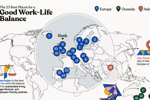
In this infographic, we explore which cities around the world excel in prioritizing work–life balance. Read more
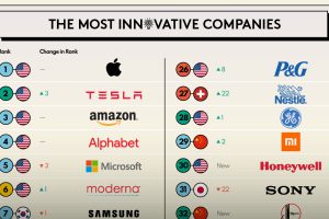
Which companies prioritize innovation the most? This infographic highlights BCG’s 2023 Most Innovative Companies ranking. Read more
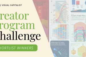
How do you visualize trade? These 9 graphics on the topic are the shortlist winners of our inaugural Creator Program Challenge. Read more

Which countries produce the most lithium, and which have the most in reserves in the ground? We look at 2022 data from the USGS. Read more

From single cells to bipedalism, humans have come a long way. Explore the fascinating journey of human evolution in this infographic. Read more
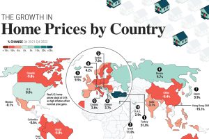
Global house prices were resilient in 2022, rising 6%. We compare nominal and real price growth by country as interest rates surged. Read more
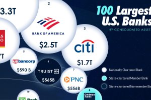
In this visual we showcase the relative size of the 100 largest U.S. banks in terms of consolidated assets. Read more
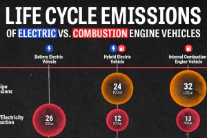
We look at carbon emissions of electric, hybrid, and combustion engine vehicles through an analysis of their life cycle emissions. Read more