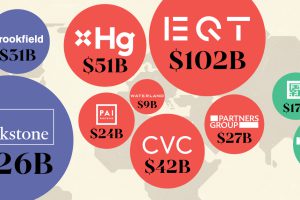
This map visualizes the leading private equity firms of major countries, ranked by capital raised over the past five years. Read more
We round up the most popular, most discussed, and most liked visualizations of the month on Voronoi, our new data storytelling platform. Read more
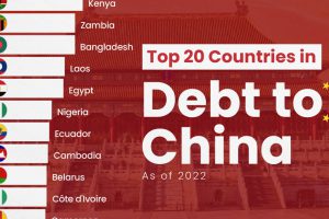
The 20 nations featured in this graphic each owe billions in debt to China, posing concerns for their economic future. Read more

We visualized the results of a LinkedIn study on the best U.S. companies to work for in 2024. Read more
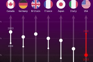
How much do you trust the government and its various institutions? We look at data for G7 countries for the time period of 2006-2023. Read more
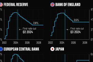
In this graphic, we show the IMF’s interest rate forecast for the U.S., Europe, the UK, and Japan for the next five years ahead. Read more

This map shows how many energy projects are in interconnection queues by state and how long these projects have been queued up, on average. Read more
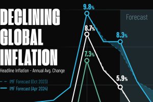
Here are IMF forecasts for global inflation rates up to 2026, highlighting a slow descent of price pressures amid resilient global growth. Read more
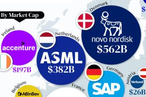
From semiconductor equipment manufacturers to supercar makers, the EU’s most valuable companies run the gamut of industries. Read more


