

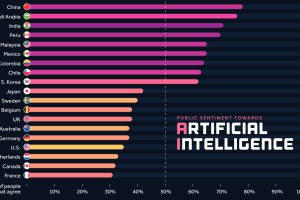
We visualize survey results from over 19,000 adults across 28 countries to see how attitudes towards AI differ around the world. Read more
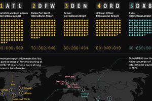
From Dubai to Charles de Gaulle, this visual ranks the world’s busiest airports in terms of passenger count. Read more

This comprehensive map explainer covers both key facts about Sudan, as well as information on the violent power struggle unfolding there Read more
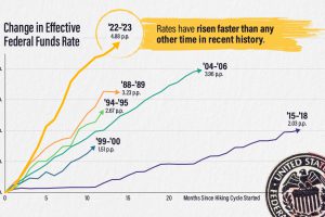
The effective federal funds rate has risen nearly five percentage points in 14 months, the fastest interest rate hikes in modern history. Read more
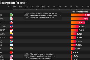
What countries have the highest real interest rates? We look at 40 economies to analyze nominal and real rates after projected inflation. Read more
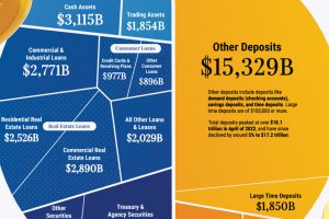
Banks play a crucial role in the U.S. economy, and understanding their balance sheets can offer insight into why they sometimes fail. Read more
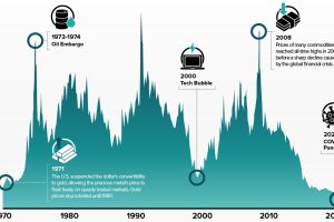
The commodities-to-equities ratio recently hit a 50-year low. In the past, when this ratio reached such levels, commodity supercycles began. Read more
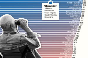
Getting ready for retirement? See which states score the highest in terms of affordability, quality of life, and health care. Read more
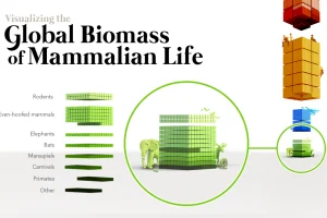
When the world’s biomass—the stuff we’re made of—is tallied up, humans and cattle outweigh wild mammals by a massive margin. Read more

We visualize the performance of ChatGPT in various professional and academic exams, highlighting the improvements of GPT-4 over GPT-3.5. Read more