

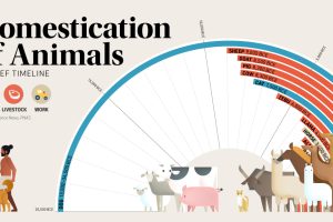
This graphic shows a timeline of when 15 different animals became domesticated, based on archaeological findings. Read more
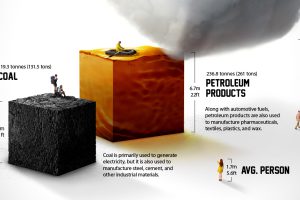
Each year the average American consumes more than 23 barrels of petroleum products. What does a lifetime of fossil fuel consumption look like? Read more
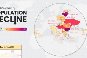
Population decline is a rising issue for many countries in Eastern Europe, as well as outliers like Japan and Cuba. Read more
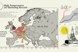
Smoldering temperatures are wreaking havoc across Europe. Here are 5 key things you should know about Europe’s current heatwave. Read more
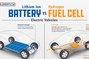
Understand the science behind hydrogen fuel cell vehicles, and how they differ from traditional EVs. Read more
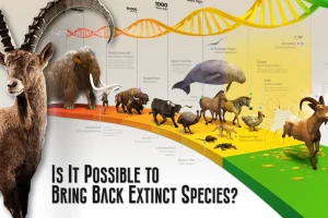
This graphic provides an introduction to de-extinction, a field of biology focused on reviving extinct animal species. Read more
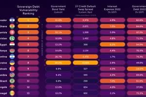
In this infographic, we examine new data that ranks the top 25 countries by their default risk. Read more
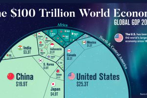
Despite ripple effects from conflict and inflation, global growth continues. According to the IMF, the global GDP will hit $104 trillion by end of year. Read more
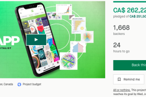
Thanks to the incredible Visual Capitalist community, the VC App has hit its funding target and will now be built. Thank you! There are just a few hours of the… Read more
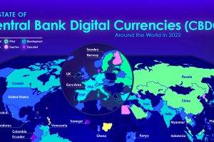
Central bank digital currencies are coming, but progress varies greatly from country to country. View the infographic to learn more. Read more